If you are continuing from the previous article you have a working site with a single page located in pages/index.tsx. You also have created reusable components for a header and footer for your site, and combined all of this using a layout component. Before you continue building out additional features we are going to focus on design by:
- Covering options available for design frameworks.
- Adding Tailwind CSS to your project.
- Extend Tailwind CSS with your own theme and add basic styles to your components.
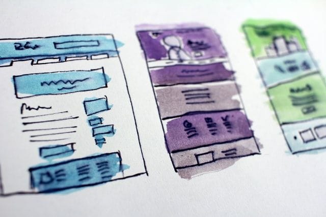
Design Frameworks
It's worth considering the needs of your web site again before deciding on a specific style library to use. You can use the same two questions covered in part one of this series to determine balance between features and flexibility. It's also important to weigh your own experience and confidence level in being able to manage the look and feel of your site.
- Bootstrap is an excellent choice when it comes to design and functionality. Bootstrap has a robust set of classes for layout, form design, and interactive elements. I've personally used Bootstrap for years and have great confidence in its abilities, including customization. A big potential disadvantage to Bootstrap is the overhead/size of the library and the learning curve if you are unfamiliar.
- MUI is a component framework specific to REACT and is overall very similar to Bootstrap. The easiest distinction between MUI and Bootstrap is that MUI follows Material Design guidelines. The decision for you to weigh is taking the advantage of a consistent design over potentially less room for customization/creativity. Users may be more comfortable seeing design elements they have encountered before - but there can also be less opportunity for your designs to stand out from other Material sites.
- Tailwind CSS is less of a component-driven framework and more of a style framework. Tailwind is described on their web site as a "utility-first CSS framework"; what this means is that Tailwind's design system is aligned to how styling actually works. In typical CSS, you would create a style like this:
.my-custom-element {
    width: 320px;
    margin: 0 auto;
    border: solid 1px #000000;
    padding: 1rem;
}
Then to associate your custom class to an element you would implement it like this:
<div class="my-custom-element">...</div>
This is how CSS was originally intended to work - you create reusable styles that can be applied to multiple elements, and maintain/change those elements quickly when needed. This was very useful in early web design when sites consisted of multiple pages - you could edit your classes and make broad changes without having to touch each individual file. The down side to this is that you are maintaining a separate class/style management system. Additionally as web sites have become more complex it can actually be more work to maintain class names and in order to implement them correctly most elements typically have multiple class names - this can lead to a lot of time in managing/troubleshooting. Tailwind aims to modernize/remove the naming system of your classes in favor of utility.
Here's the same style as .my-custom-element in Tailwind:
<div class="w-320px mx-auto border border-black p-4">...</div>
The end result is the same, but in Tailwind's favor this is easier to maintain; it does not require a separate set of class names and the class names being used are easy to interpret. This is especially useful in an environment like NEXT.js where you are already building reusable components and don't necessarily need to create a specific element style more than once. Tailwind is also lightweight - when you compile a project using Tailwind, the classes are automatically generated based on only what you have specified in your project; this can result in a footprint that is up to 10x smaller than a Bootstrap or MUI site.
The biggest potential disadvantage in Tailwind to consider is that you will need to be relatively comfortable in understanding how CSS elements work - Tailwind is shorthand for existing CSS. There is a cheat sheet available that can help you get up to speed.
For this project I am using Tailwind CSS; I am not covering the creation/use of framework-specific components. Tailwind does also have a component library that can be used which offers similar capabilities to Bootstrap or MUI.
Adding Tailwind CSS to Your Project
From the VSCode terminal window in your project folder, enter the following to install Tailwind CSS:
npm install -D tailwindcss postcss autoprefixer
npx tailwindcss init -p
Tailwind CSS should now be added to your project along with PostCSS and AutoPrefixer. The npx command creates the file tailwind.config.js and postcss.config.js in your project root folder. The content block tells Tailwind which directories and page types to look at to know which classes you are using - open tailwind.config.js and update it as follows:
module.exports = {
  content: [
    './pages/**/*.{html,js,ts,tsx}',
    './components/**/*.{html,js,ts,tsx}'
  ],
  theme: {
    extend: { },
  },
  plugins: [ ],
};
Open the file styles/globals.css and add the following:
@tailwind base;
@tailwind components;
@tailwind utilities;
If you run your local site now using npm run dev you will see... literally nothing - even default HTML styles are no longer being applied; this is by design; Tailwind effectively "resets" the entire style by default - this ensures you are starting with a clean design slate and can focus on additive design = every style will be an explicit decision.
Customizing Tailwind Styles
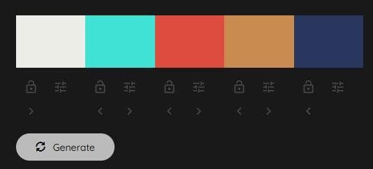
Before you begin styling your components I am going to quickly touch on theme customization in Tailwind. Specifically you are going to extend the tailwind theme to incorporate your own color scheme.
For starters I will get a color palette from colormind to find a unique set of colors to use. Cycle through different choices using the Generate button until you land on something you think would be good to incorporate into your site:
Open the file tailwind.config.js again; this time update the content to look like the following:
module.exports = {
  content: [
    './pages/**/*.{html,js,ts,tsx}',
    './components/**/*.{html,js,ts,tsx}'
  ],
  theme: {
    extend: {
      colors : {
        mysite: {
          dark: '#272F2D',
          darkaccent: '#696C7A',
          brand: '#6A7E9B',
          lightaccent: '#848F83',
          light: '#EEF0EB',
        }
      }
    },
  },
  plugins: [],
};
For the color codes, replace what is shown in the example with the color codes you generated. Now you have created a custom color pallette in your site - it's accessible by using the classnames constructed above, ex. bg-mysite-dark. Open the file components/header.tsx and modify it to look like the following:
import Link from 'next/link';
import { SITE_NAME } from '../lib/constants';
const Header = () => {
return (
<>
<div className="w-full bg-mysite-dark shadow">
<nav className='relative flex flex-wrap items-center justify-between mb-1 p-3'>
<div className='text-2xl text-mysite-light pl-3 lowercase font-semibold tracking-widest'>{SITE_NAME}</div>
<div className=' text-mysite-light pr-4'>
<Link as={"/"} href="/">
<a title="Home page link">Home</a>
</Link>
</div>
</nav>
</div>
</>
)
};
The next update will be for components/footer.tsx. One extra addition here is to make the footer stick to the bottom of the page; the first <div> tag ensures that the end of the actual content of your page doesn't run behind the footer:
import Container from './container';
import { SITE_NAME } from '../lib/constants';
const Footer = () => {
return (
<>
<div className="clear-both lg:h-16"></div>
<footer className='w-full lg:h-12 fixed inset-x-0 p-4 bottom-0 mt-4 bg-cyan-100 bg-opacity-80 text-sm lowercase text-right'>
<Container>
<div>{SITE_NAME} © { new Date().getFullYear() }</div>
</Container>
</footer>
</>
)
};
Update components/layout.tsx as follows; in this example you are just adding a default padding to the content section of the template:
import Footer from './footer'
import Header from './header'
type Props = {
children: React.ReactNode
}
const Layout = ({ children }: Props) => {
return (
<>
<Header />
<div id='content' className='p-2'>
<main>{children}</main>
</div>
<Footer />
</>
)
}
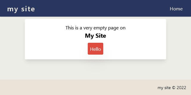
If your site is not currently running start it using npm run dev. Now your home page look like the below:
Member discussion: